Versus Media
Context
Versus was born in 2011 from a simple idea between two friends: a space to share and create video game content. We grew up playing Smash Bros., GTA, and Yu-Gi-Oh! — those were our inspiration, and our starting point.
Problem zero experience
We needed a brand that transmitted credibility and personality at the same time, without the resources of a big company. The brand also needed to stick with the user and evolve through the years.
Solution
The name Versus was inspired by classic arcade games, specifically fighting games — this is where the concept of displaying only the icon originated, as it remains a constant in those games to this day. For us, Versus comes from the Latin word meaning "turned toward," reflecting our drive to move closer to our goals, and ultimately, to push beyond them.
Outcome evolving media
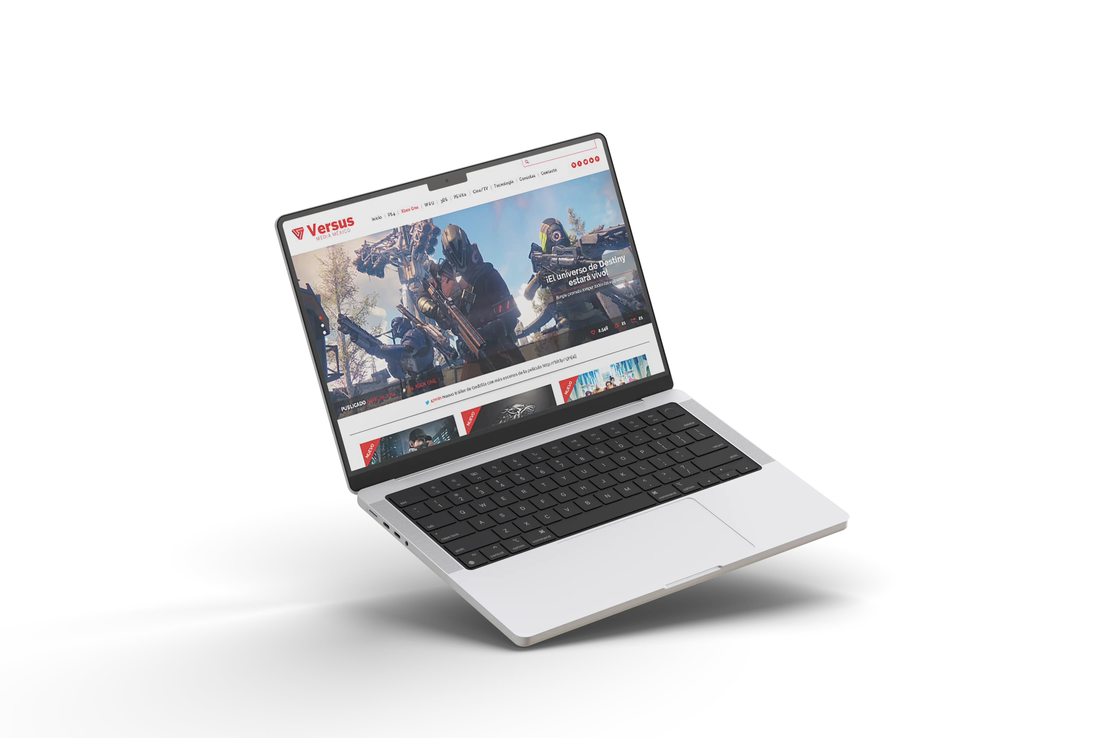
Versus has been live since 2014 under the same identity, earning the trust of major companies like PlayStation, Nintendo, and Xbox, and building a closer, more fraternal team along the way. Since 2015, it has evolved into a fully digital format through short video.
The challenge
Where we started
Back in 2011, we had no industry knowledge, no servers, no roadmap — and no budget. One of us was still in university; the other had just graduated. What we did have was a name and a direction.
Our starting point was the literal definition of the Latin word versus: turned toward. We locked our eyes on a singular horizon — creating a space for gamers — and built everything from scratch from there.
- We started with zero technical or industry expertise, only a core name and a vision.
- Every error page, every failed deploy, every design iteration taught us something we couldn't have learned any other way.
Shaping the flow
For nearly two years, we worked in the shadows. We learned to code, designed and redesigned interfaces, and figured out what the brand needed to become — not just visually, but editorially.
We weren't building a website. We were building a voice.
Versus
The first stepsThe creation
Creative process
The icon's inspiration comes from fighting games, where the VS appears at the top center of the screen before every match. The isotype merges two letters — V and S — creating a link between the host and the audience.
The primary colors, PMS 7626C and PMS 7427C, were chosen to reflect passion and dynamism, and to align the brand with its commitment: becoming a trustworthy voice in gaming culture.
We chose Benton Sans because it provides clarity and legibility without pretension — and because it holds up on mobile screens, which mattered from the beginning.
The rookies
One of our biggest early challenges was the website itself. We launched the first version built entirely from scratch — and quickly realized the brand was growing faster than the infrastructure could support. Stability became a problem, and we had to move fast.
We turned to WordPress. It meant letting go of our original design vision, but it proved to be the right call — and it's still the right call today.
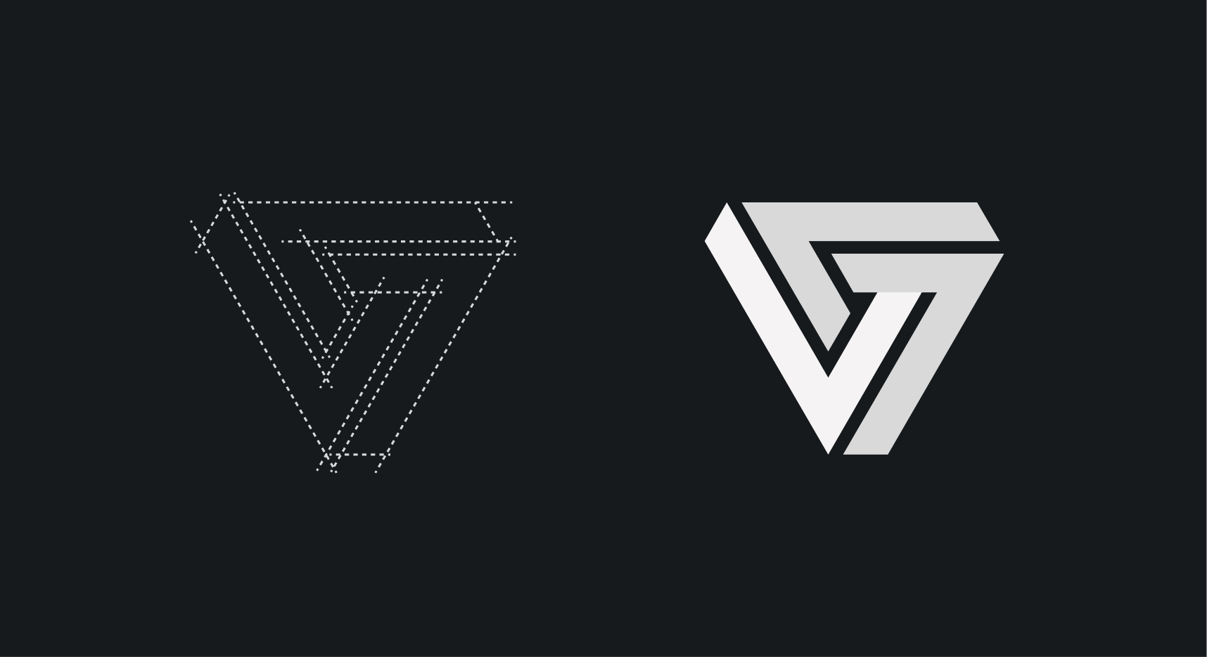 Isotype
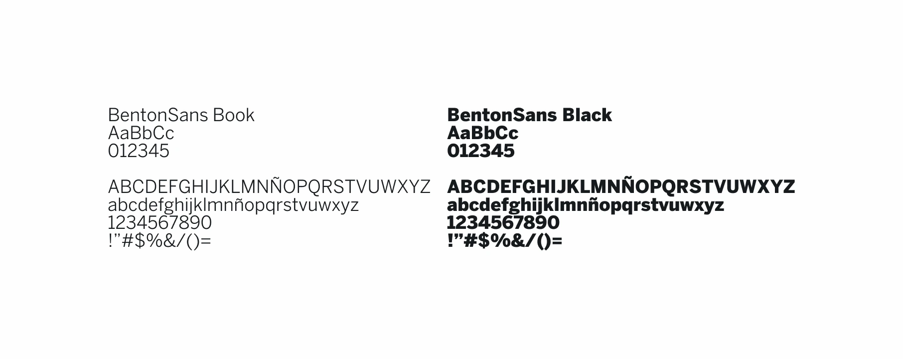 Typography
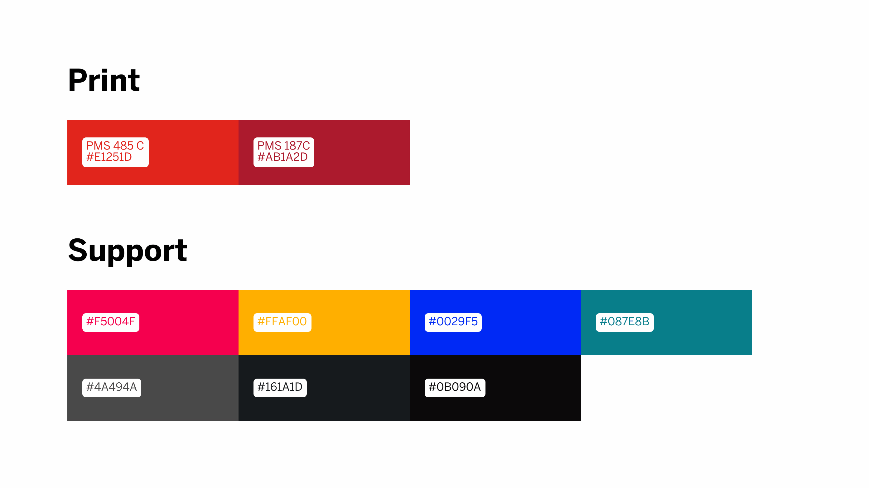 Color palette
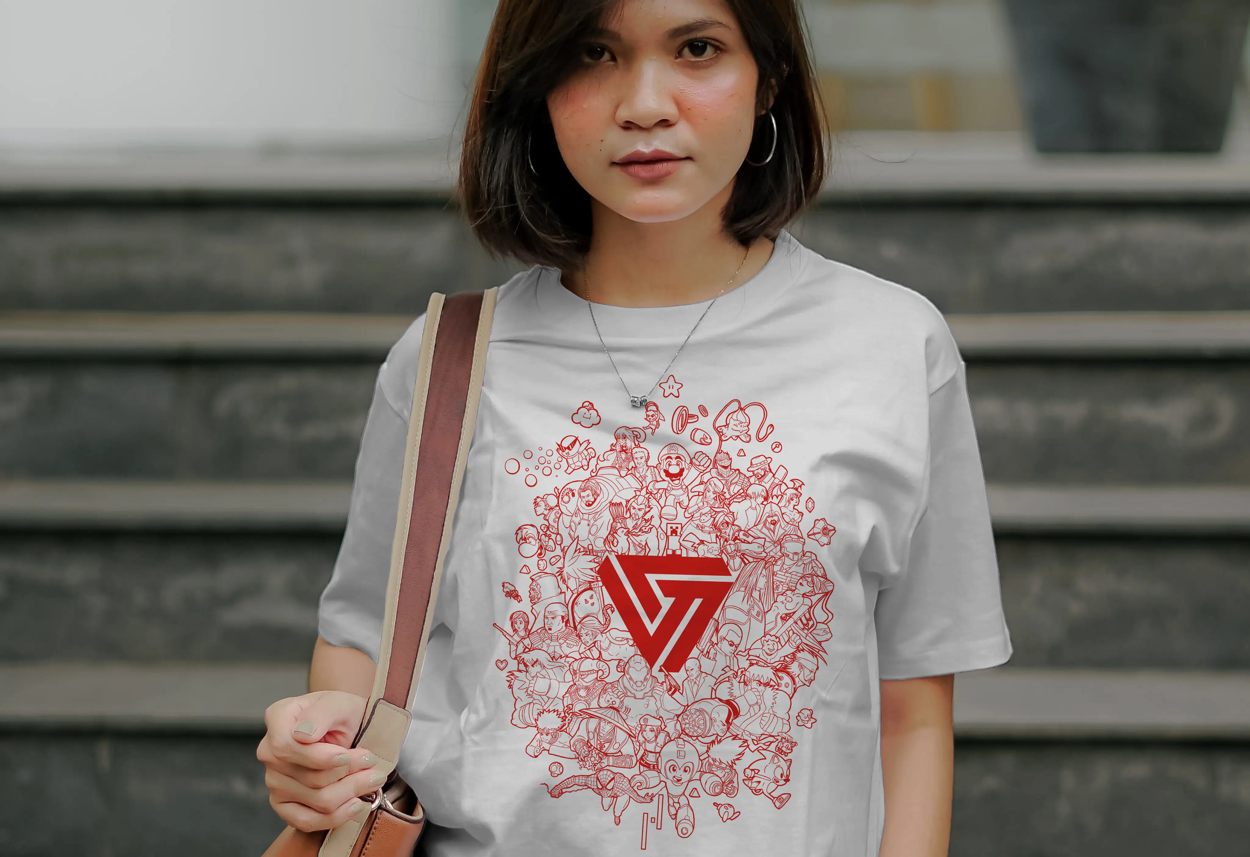 Podcast #100
The impact and next steps
Where we landed live for 12+ years
Versus became a specialized media outlet covering gaming, tech, and film in Spanish, with an average audience that is 80% LATAM.
“We always wanted to build something meaningful — a community. We did it, and we'll continue doing it.”
The work continued
In 2025, we moved to short video entirely:
- We created VersusBit, which started as fast-news video and has since evolved into evergreen content.
- We shortened our reviews to 3 minutes, keeping our standards and objective-focused analysis.
We're still committed to our community and to delivering high-quality content. Follow us.
 Our brand
 First web design